
Craigslist Redesign
Redesigning Craigslist for enhanced usability
Revitalising Craigslist’s interface with a streamlined, user-friendly redesign that reduces clutter and enhances navigation, while preserving its iconic minimalist aesthetic and staying true to the platform’s original, retro web design roots.
*View on desktop for the full case studyYear: 2024
Timeline: 6 weeks
Advisor: Defne Kaynak
Role: Solo Project (UX/UI Designer, Researcher, Brand Development & Designer)
Skills: Figma, Wireframing, High/Low Fidelity Prototyping, Brand Identity Design, Typography, Product Design, User Research


Overview
Craigslist is a cornerstone in the online classifieds market and has long been known for its straightforward functionality. However, its design has remained largely unchanged since its founding over 25 years ago , leading to a user experience that, although nostalgic, many find reductive and visually unappealing. For this project, I undertook the challenge of redesigning the Craigslist desktop platform to address these issues. The primary goal was to revitalise the user interface, making it more engaging and efficient while retaining the platform's essential features. Through a process of research, ideation, and iterative design, I aimed to create a modern, user-centred experience that improves navigation, readability, and overall satisfaction for users, all the while maintaining the ethos of Craigslist’s initial purpose.
Jump to final redesignThe Challenge
Craigslist’s minimalist design has long been both its strength and its weakness. While the platform is widely recognised for its simplicity and functionality, its outdated, rudimentary interface often hinders user experience, especially in comparison to modern platforms. Striking the balance between modernisation and preserving its utilitarian charm was essential, as the goal was not to create just another sleek, flat e-commerce site, but to honour its unique, barebones HTML styled roots while making it more user-friendly and accessible.
I will be specifically redesigning the user experience and interface for an user's journey when purchasing a product on Craigslist.
How Might We…
Redesign Craigslist’s desktop interface to improve usability and visual appeal while maintaining the raw, stripped-down aesthetic that defines its original identity.
Redesign Craigslist’s desktop interface to improve usability and visual appeal while maintaining the raw, stripped-down aesthetic that defines its original identity.
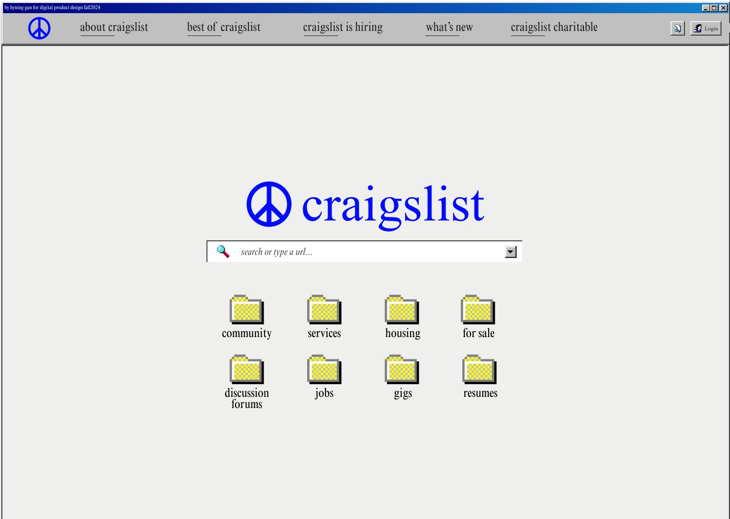
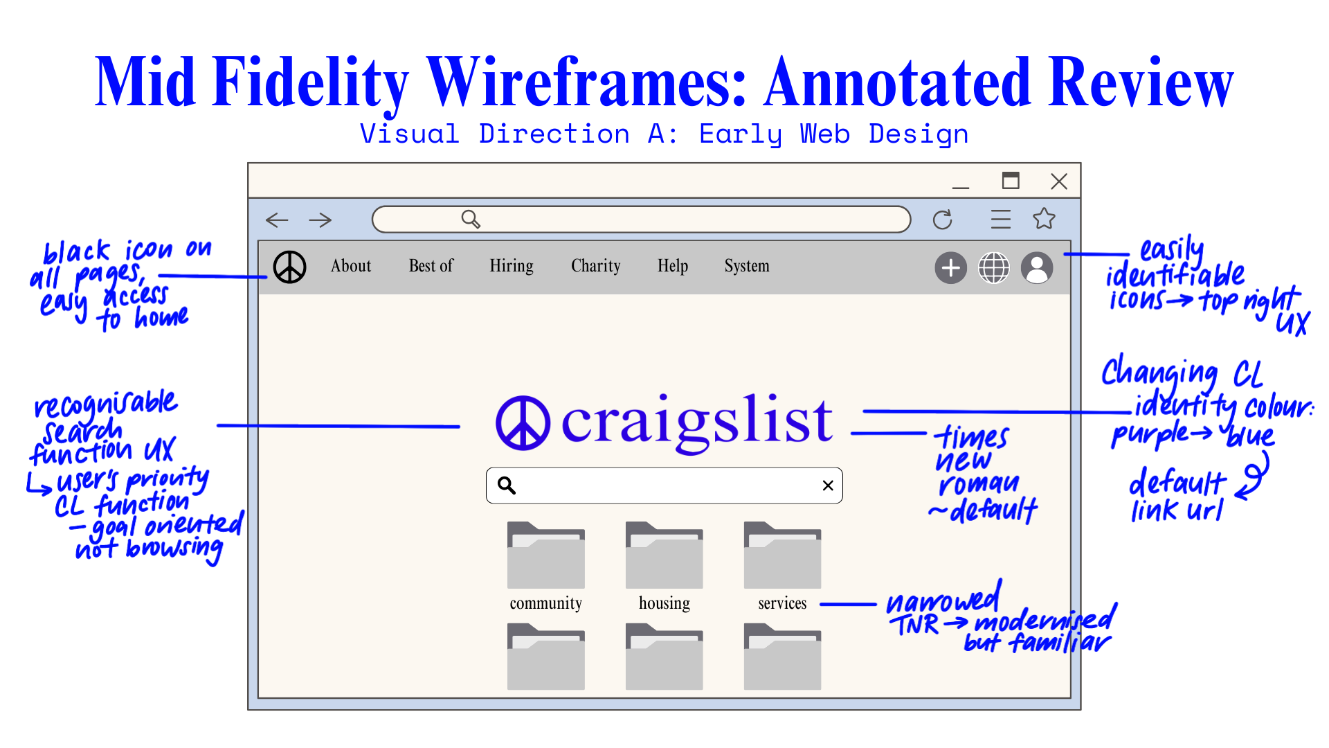
Direction A: Early Web Design
• Emphasised a search-centered framework as the primary method for users to find what they need, streamlining the discovery process.
• Included category-based exploration as an additional option, making it easier for users to navigate content without sifting through multiple links.
• Cohesive filtering and navigation structure that will carry across pages for a consistent user experience.
››››
››››
Final Redesign
User Feedback & Reflections
Refine Category Pages: Enhance engagement with subtle visual cues and interactive filters to make browsing more intuitive.
Enhance Search Filters: Add real-time filtering and personalised recommendations to streamline results for users.
Improve Readability: Test bolder fonts and higher contrast in key areas to boost readability while maintaining minimalism.
Align Display Flow: Make interface adjustments for smoother transitions between desktop and mobile, especially for posting, searching.
Balance Nostalgia with Usability: Refine retro elements to improve intuitiveness, preserving the design’s unique character.
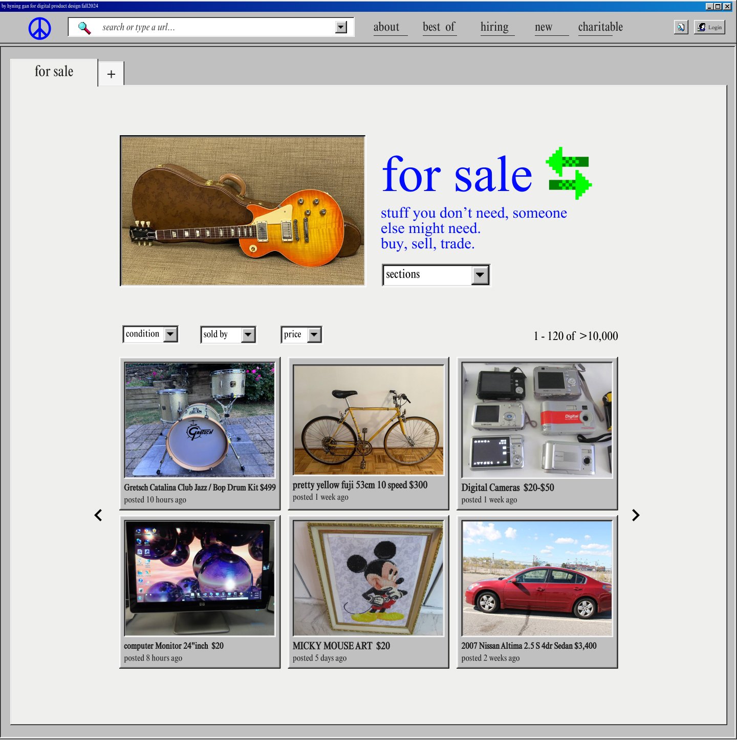
They goes on Craigslist to browse for bikes. A friend of theirs recommended getting a cruiser bike saying they are good for riding around the city, so that’s what they’re looking for. They also doesn’t want to spend more than $400.
They goes on Craigslist NY.
They changes the filtering to be “Brooklyn” (instead of all New York), and clicks on “bikes”.
They filters out the results to match what she’s looking for.
They browses the results and sees one that they’re interested in.
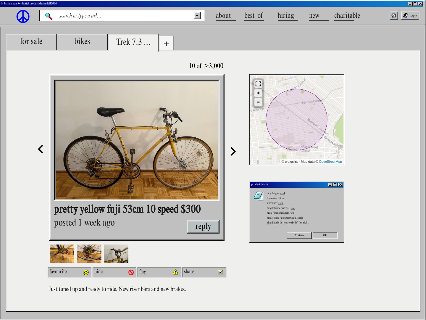
They click on it to see more about it and decides that it’s a great option for them and they wants to contact the seller.
Go to Craigslist BK
Find and choose a bike
Early Concept Brainstorm
To begin the concept ideation process, I explored two potential visual directions (click to enlarge):
Mid Fidelity Wireframes
››››
Design Process

User Persona & Journey
For this project, I will be focusing on a specific user scenario and journey:

Go to Craigslist BK
Go to Craigslist BK
This is Sam (They/Them). They’re 26 and recently moved to Brooklyn for a job. They’ve been trying to get to know the city in a new way, and is interested in purchasing a bike to get around.
››››
Browse & filter for bikes
Go to Craigslist BK
››››
››››
Product Analysis
I conducted a detailed evaluation of the existing Craigslist desktop experience to identify areas for improvement and core usability challenges. The analysis focused on navigation complexity, information hierarchy, and visual structure, highlighting how Craigslist’s iconic but dated interface impacts the overall user experience.
››››
Low Fidelity Wireframes
Industry Audit
To understand best practices in modern e-commerce design, I performed an industry audit of eBay’s desktop and mobile interfaces, focusing on its navigation, visual hierarchy, and responsiveness. eBay’s use of category-based navigation and adaptable layout provides valuable insights into effective e-commerce experiences, especially in balancing functionality with visual appeal.
››››
Contact seller for purchase
Go to Craigslist BK
Direction B: Minimalist
• Focused on reorganising content to improve readability and enhance the hierarchy of information on the homepage.
• Worked on enhancing the homepage’s visual legibility with clear structure, colour, and imagery to guide users without overwhelming them.
• Explored the idea of dedicated category pages, allowing users to browse intuitively and drill down into specific content, creating a more engaging browsing experience.
Direction A: Early Web Design
• Emphasised a search-centered framework as the primary method for users to find what they need, streamlining the discovery process.
• Included category-based exploration as an additional option, making it easier for users to navigate content without sifting through multiple links.
• Cohesive filtering and navigation structure that will carry across pages for a consistent user experience.
Visual Design System
Inspired by early web design, using default HTML and CSS aesthetics to preserve Craigslist’s minimalist, utilitarian identity while including more modern UI designed elements.
View in full screen and on desktop to have the best interactive experience!